TitleButton
Title buttons are individual elements or modules that make up the profile. These can include various functionalities or data points that contribute to the profile’s overall purpose.
TitleButton Database Table Structure
The TitleButton model represents interactive buttons that allow users to perform specific actions related to records within the profile. These actions can include creating, downloading or accessing other functionalities.
The PostgreSQL table TitleButton consists of the following fields:
-
-
id(Integer): -
The primary key and unique identifier for each title button
-
-
-
name(String): -
The internal name of the title button used to identify the title button. It is often used in the code to refer to the button
-
-
-
template(String): -
The HTML template string used to render the button. It includes various HTML attributes such as style, title, CSS classes and icon elements
-
-
-
additional_attr(String): -
Any additional attributes required for the button. It is often used to store URLs or other necessary data for the button’s functionality
-
Hint
Click the  button below to view the contents
TitleButton database fields
 id |                name                      |                                                                                                                        template                                                                                                                                               |     additional_attr
----+------------------------------------------+-------------------------------------------------------------------------------------------------------------------------------------------------------------------------------------------------------------------------------------------------------------------------------+--------------------------
  1 | accept_reject_samples                    | <button style="display: none" title="Accept or reject Tree of Life samples" class="big circular ui icon teal button accept_reject_samples copo-tooltip" data-tour-id="accept_reject_samples_title_button">         <i class="icon tasks sign"></i>     </button>              |
  2 | copo_accessions                          | <button style="display: none" title="View accessions dashboard" class="big circular ui icon pink button copo_accessions copo-tooltip" data-tour-id="accession_dashboard_title_button">         <i class="icon sitemap"></i>     </button>                                     |
  3 | download_blank_manifest_template         | <a  title="Download manifest template" class="big circular ui icon brown button download-blank-manifest-template copo-tooltip" target="_blank" data-tour-id="download_blank_manifest_title_button">         <i class="icon download sign"></i>     </a>                       | href:#blank_manifest_url
  4 | download_sop                             | <a title="Download Standard Operating Procedure (SOP)" class="big circular ui icon yellow button download-sop copo-tooltip" target="_blank" data-tour-id="download_sop_title_button">         <i class="icon download sign"></i>     </a>                                     | href:#sop_url
  5 | new_component_template                   | <button title="Add record" class="big circular ui icon primary button new-component-template copo-tooltip" data-tour-id="new_component_title_button">         <i class="icon add sign"></i>     </button>                                                                     |
  6 | new_general_sample_spreadsheet_template  | <button style="display: inline" title="Add or update samples from spreadsheet" class="big circular ui icon button new-general-sample-spreadsheet-template copo-tooltip" data-tour-id="new_spreadsheet_title_button">         <i class="icon table sign"></i>     </button>    |
  7 | new_local_file                           | <button title="Add file by browsing local file system" class="big circular ui icon primary button new-local-file copo-tooltip" data-tour-id="new_file_button_local">         <i class="icon desktop sign"></i>     </button>                                                  |
  8 | new_reads_spreadsheet_template           | <button style="display: inline" title="Add reads from spreadsheet" class="big circular ui icon button new-reads-spreadsheet-template copo-tooltip" data-tour-id="new_spreadsheet_title_button">         <i class="icon table sign"></i>     </button>                         |
  9 | new_samples_spreadsheet_template         | <button   title="Add or update samples from spreadsheet" class="big circular ui icon button new-samples-spreadsheet-template copo-tooltip" data-tour-id="new_samples_button">         <i class="icon table sign"></i>     </button>                                           |
 10 | new_singlecell_spreadsheet_template      | <button style="display: inline" title="Add study from spreadsheet" class="big circular ui icon button new-singlecell-spreadsheet-template copo-tooltip" data-tour-id="new_spreadsheet_title_button">         <i class="icon table sign"></i>     </button>                    |
 11 | new_taggedseq_spreadsheet_template       | <button style="display: inline" title="Add tagged sequences from spreadsheet" class="big circular ui icon button new-taggedseq-spreadsheet-template copo-tooltip" data-tour-id="new_spreadsheet_title_button">         <i class="icon table sign"></i>     </button>          |
 12 | new_terminal_file                        | <button title="Add file by terminal" class="big circular ui icon primary button new-terminal-file copo-tooltip"  data-tour-id="new_file_button_terminal">         <i class="icon terminal sign"></i>     </button>                                                            |
 13 | quick_tour_template                      | <button title="Take a tour of this page" class="big circular ui icon orange button start-tour quick-tour-template copo-tooltip" data-tour-id="quick_tour_title_button">         <i class="icon lightbulb"></i>     </button>                                                  |
 14 | tol_inspect                              | <button style="display: none" title="Inspect Tree of Life data" class="big circular ui icon yellow button tol_inspect copo-tooltip" data-tour-id="tol_inspect_title_button">         <i class="icon clipboard list"></i>     </button>                                        |
 15 | tol_inspect_gal                          | <button class="big circular ui icon green button tol_inspect_gal copo-tooltip" title="Inspect Tree of Life data by Genome Acquisition Labs" data-tour-id="tol_inspect_gal_title_button">         <i class="icon building"></i>     </button>                                  |
Description of each TitleButton record
new_component_template: Button to add a new profile record. It is styled with a primary colour and an icon of an add sign
quick_tour_template: Button to start a quick tour. It is styled with an orange colour and an icon of a lightbulb
new_samples_spreadsheet_template: Button to add samples from a spreadsheet template. It is styled with a teal colour and an icon of a table sign
new_reads_spreadsheet_template: Button to add reads from a spreadsheet template. It is styled with a teal colour and an icon of a table sign
-
new_local_file: Button to add a new file by browsing the local file system. It is styled with a primary colour and an icon of a desktop sign
-
new_terminal_file: Button to add a new file by terminal. It is styled with a primary colour and an icon of a terminal sign
-
new_taggedseq_spreadsheet_template: Button to add tagged sequences from a spreadsheet template. It is styled with a teal colour and an icon of a table sign
download_blank_manifest_template: Button to download a blank manifest template. It is styled with a brown colour and an icon of a download sign
download_sop: Button to download the SOP. It is styled with a yellow colour and an icon of a download sign
-
accept_reject_samples: Button to accept or reject ToL samples. It is styled with a teal colour and an icon of tasks
-
tol_inspect: Button to inspect the ToL samples. It is styled with a yellow colour and an icon of a clipboard list
-
tol_inspect_gal: Button to inspect the ToL by Genome Acquisition Lab (GAL). It is styled with a green colour and an icon of a building
copo_accessions: Button to access the Accessions Dashboard. It is styled with a pink colour and an icon of a sitemap

Referencing Created TitleButton in Project
Note
-
Ensure that a Django app is created to manage the
TitleButtonDjango model and render the buttons in the template.Refer to the Creation of Component section which explains how to create a Django app for a component
-
Ensure that static files like CSS and JS files are correctly configured in the Django project
settings.pyfile# settings.py STATIC_URL = '/static/' STATICFILES_DIRS = [BASE_DIR / 'static']
Hint
Click the button below to view the contents
See also
Understanding COPO’s Project Structure section which explains the structure of a Django project.
# myapp/views.py
from django.shortcuts import render
from django.views import View
from .models import TitleButton

class TitleButtonView(View):
    def get(self, request):
        my_models = TitleButton.objects.all()
        return render(request, 'myapp/myapp.html', {'title_button_def':
        my_models})
# myapp/urls.py
from django.urls import path
from .views import TitleButtonView

urlpatterns = [
    path('title-buttons/', TitleButtonView.as_view(), name='title_buttons'),
]
In the template HTML file (
myapp.html), reference each element from the TitleButton table.
TitleButton example template
<!-- myapp/templates/myapp/title_button.html -->
<!DOCTYPE html>
<html lang="en">
<head>
    <meta charset="UTF-8">
    <title>Title Buttons</title>
    <link rel="stylesheet" href="{% static 'your_app/css/styles.css' %}">
    <script src="{% static 'your_app/js/title_buttons.js' %}"></script>
    <script>
        const component_def = {
          {% for component in component_def %}
            {{ component.name|lower }}:  {
              component: '{{ component.name }}',
              title: '{{ component.title }}',
              {% if component.subtitle %}
              subtitle: '{{ component.subtitle }}',
              {% endif %}
              iconClass: '{{ component.widget_icon_class }}',
              semanticIcon: '{{ component.widget_icon }}',
              buttons: [ {% for button in component.title_buttons.all %} '{{ button.name }}', {% endfor %} ],
              sidebarPanels: ['copo-sidebar-info'],
              colorClass: '{{ component.widget_colour_class }}',
              color: '{{ component.widget_colour }}',
              tableID: '{{ component.table_id }}',
              recordActions: [ {% for button in component.recordaction_buttons.all %} '{{ button.name }}', {% endfor %} ],
              url: "{% if component.reverse_url %}{% url component.reverse_url profile_id='999' %}{% endif %}",
            },
          {% endfor %}
        }

        const title_button_def = {
          {% autoescape off %}
          {% for button in title_button_def %}
            {{ button.name  }} : {
              template: `{{ button.template }}`,
              additional_attr: '{{ button.additional_attr }}',
              },
          {% endfor  %}
          {% endautoescape %}
        }
    </script>
</head>
<body>
    <ul>
        <li>
            <button title="Add new profile record" class="big circular ui icon primary button new-component-template copo-tooltip">
                <i class="icon add sign"></i>
            </button>
        </li>
        <li>
            <button title="Quick tour" class="big circular ui icon orange button takeatour quick-tour-template copo-tooltip">
                <i class="icon lightbulb"></i>
            </button>
        </li>
        <li>
            <button title="Add Sample(s) from Spreadsheet" class="big circular ui icon button new-samples-spreadsheet-template copo-tooltip">
                <i class="icon table sign"></i>
            </button>
        </li>
        <li>
            <button title="Add Read(s) from Read Spreadsheet" class="big circular ui icon button new-reads-spreadsheet-template copo-tooltip">
                <i class="icon table sign"></i>
            </button>
        </li>
        <li>
            <button title="Add new file by browsing local file system" class="big circular ui icon primary button new-local-file copo-tooltip">
                <i class="icon desktop sign"></i>
            </button>
        </li>
        <li>
            <button title="Add new file by terminal" class="big circular ui icon primary button new-terminal-file copo-tooltip">
                <i class="icon terminal sign"></i>
            </button>
        </li>
        <li>
            <button title="Add Tagged Sequence (s) from Tagged Sequence Spreadsheet" class="big circular ui icon button new-taggedseq-spreadsheet-template copo-tooltip">
                <i class="icon table sign"></i>
            </button>
        </li>
        <li>
            <a title="Download Blank Manifest Template" class="big circular ui icon brown button download-blank-manifest-template copo-tooltip" target="_blank" href="#blank_manifest_url">
                <i class="icon download sign"></i>
            </a>
        </li>
        <li>
            <a title="Download Standard Operating Procedure (SOP)" class="big circular ui icon yellow button download-sop copo-tooltip" target="_blank" href="#sop_url">
                <i class="icon download sign"></i>
            </a>
        </li>
        <li>
            <button style="display: none" title="Accept/Reject TOL Samples" class="big circular ui icon teal button accept_reject_samples copo-tooltip">
                <i class="icon tasks sign"></i>
            </button>
        </li>
        <li>
            <button style="display: none" title="Inspect TOL" class="big circular ui icon yellow button tol_inspect copo-tooltip">
                <i class="icon clipboard list"></i>
            </button>
        </li>
        <li>
            <button class="big circular ui icon green button tol_inspect_gal copo-tooltip" title="Inspect TOL by GAL">
                <i class="icon building"></i>
            </button>
        </li>
        <li>
            <button style="display: none" title="View Accessions Dashboard" class="big circular ui icon pink button copo_accessions copo-tooltip">
                <i class="icon sitemap"></i>
            </button>
        </li>
    </ul>
</body>
</html>
Handle any JavaScript functionality needed for the buttons in the JS file (
myapp.js)
Title button example javascript
// myapp/static/myapp/js/title_button.js
$(document).ready(function () {
var componentName = $('#nav_component_name').val();
// 'component_def' is defined in the 'title_button.html' file
var componentMeta = null;
componentMeta = component_def[componentName]
// 'get_component_meta' reference
var component = componentMeta;
// Ignored obsolete code about creating page title and adding
// it to the page 'buttonsSpan'
// Create buttons
var buttonsSpan = $('<span/>', {style: 'white-space:nowrap;'});
if (component.buttons) {
component.buttons.forEach(function (item) {
button_str = title_button_def[item.split('|')[0]].template
additional_attr = title_button_def[item.split('|')[0]].additional_attr
button = $(button_str);
if (additional_attr != undefined) {
attrs = additional_attr.split(',');
for (var i = 0; i < attrs.length; ++i) {
if (attrs[i].indexOf(':') > -1) {
key = attrs[i].split(':')[0];
value = attrs[i].split(':')[1];
if (value.indexOf('#') > -1 || value.indexOf('.') > -1) {
button.attr(key, $(value).val());
} else {
button.attr(key, value);
}
}
}
}
buttonsSpan
.append(button)
.append("<span style='display: inline;'> </span>");
});
}
});
Visualisation of TitleButton in Project
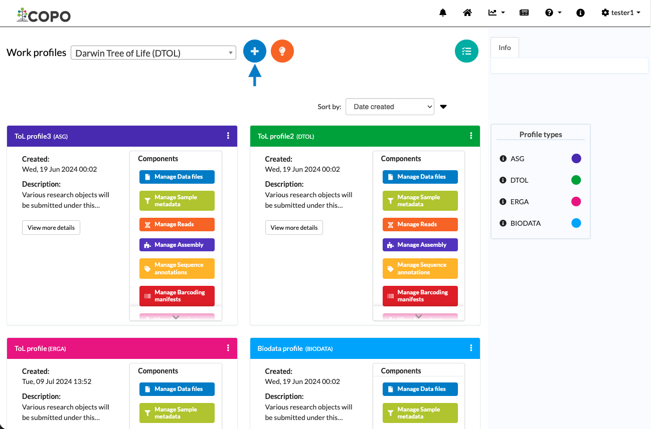
Work profiles page: Visual representation of ‘new component’ title button
new_component_template button displays the tooltip Add record when hovered over. It is the
 button indicated by the blue arrow in the image
above.
button indicated by the blue arrow in the image
above.
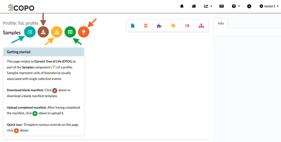
Visual representation of ‘accept or reject samples’, ‘download blank manifest’, ‘download SOP’, ‘new samples spreadsheet and ‘quick tour’ title buttons on Samples page
quick_tour_template button displays the tooltip Take a tour of this page when hovered over. It is the
 button indicated
by the orange arrow in the image above.
button indicated
by the orange arrow in the image above.-
new_samples_spreadsheet_template button displays the tooltip Add or update samples from spreadsheet when hovered over. It is the
 button indicated by the green arrow.
The colour of the
button is based on the type of
profile that you are making a submission to.See the Profile Types Legend section regarding the colour code for the various types of project profiles on COPO.
download_blank_manifest_template button displays the tooltip Download blank manifest template when hovered over. It is the
 button indicated by the brown arrow.
download_sop: button displays the tooltip Download Standard Operating Procedure (SOP) when hovered over. It is the
 button indicated by the yellow arrow.
accept_reject_samples button displays the tooltip Accept or reject Tree of Life samples when hovered over. It is the
 button indicated by the teal arrow and will only appear on the page if you are granted permission to be a
sample manager.
button indicated by the teal arrow and will only appear on the page if you are granted permission to be a
sample manager.