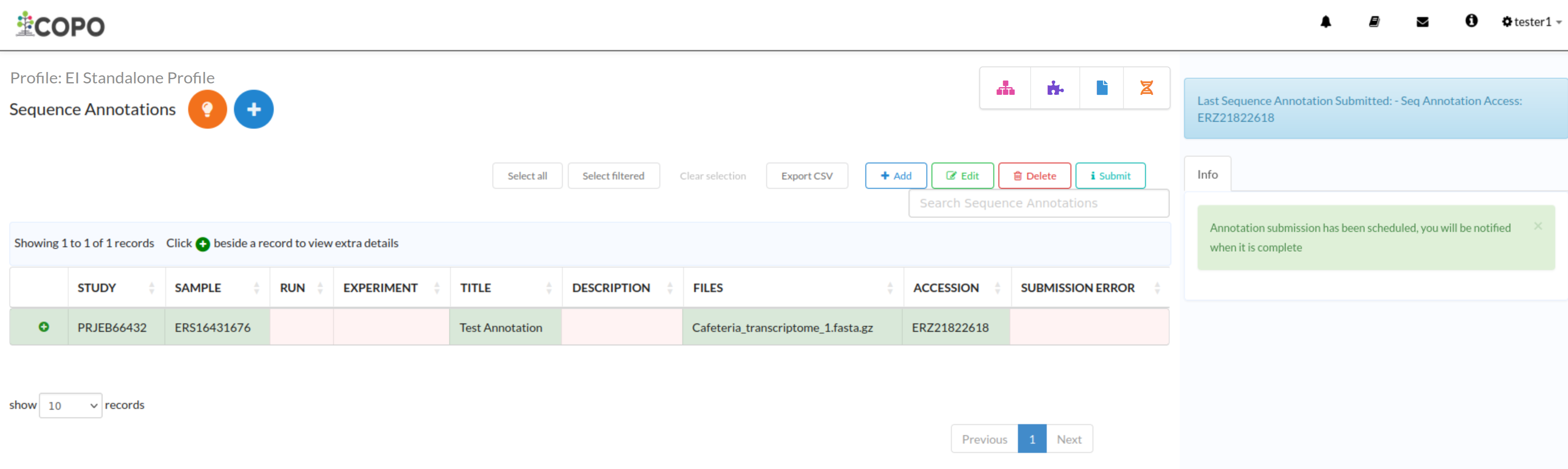
The component icon navigation pane provides a quick access to other components
associated with the same profile. It appears on the inner right pane of the
screen when you are viewing a component’s page. The icons displayed in the
navigation pane correspond to the components associated with the profile.
If you are unsure what each icon represents, you can perform any of the
following:
Hover over the icon in the component icon navigation pane to see a tooltip
with the component’s name
The navigation pane will not display the icon associated with the page
that is currently being viewed.
If a component has subcomponents, a dropdown menu is shown when at least
two items are available. However, if you are viewing a subcomponent’s
page and only one item remains, that item is displayed directly in the
navigation pane.
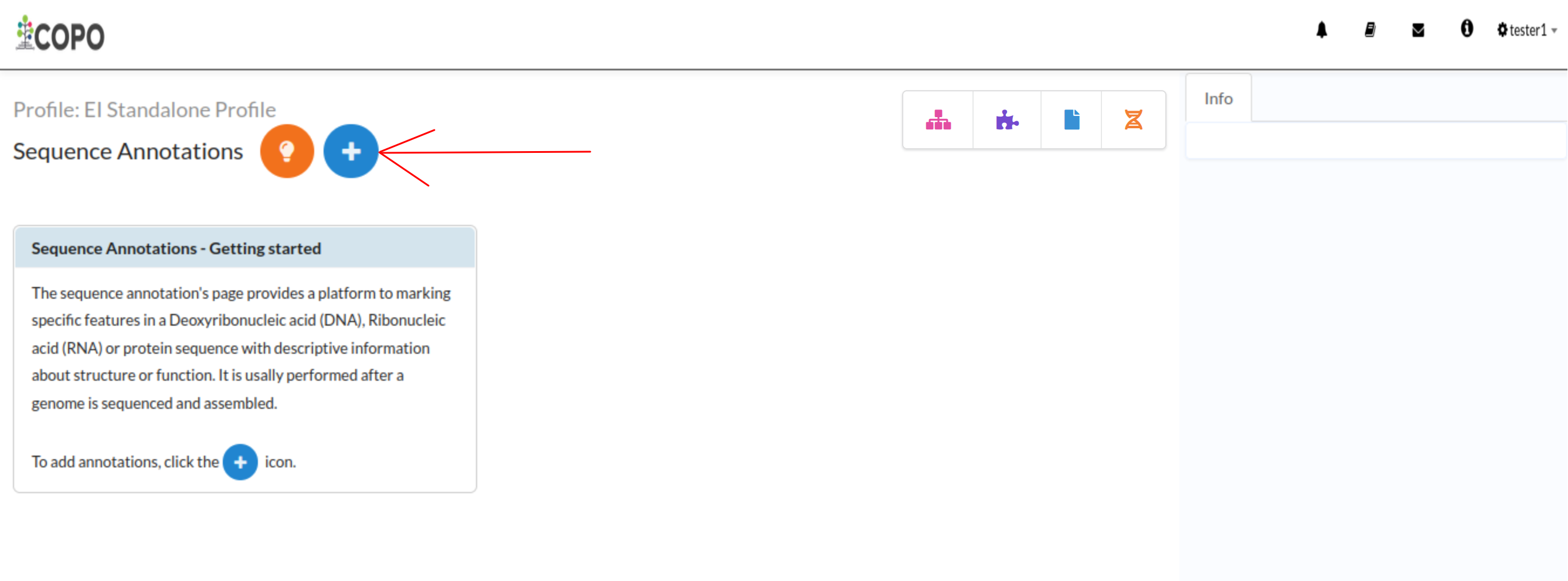
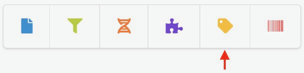
Navigation pane showing the Sequence Annotations component icon
 component button in the
Components column as shown below:
component button in the
Components column as shown below: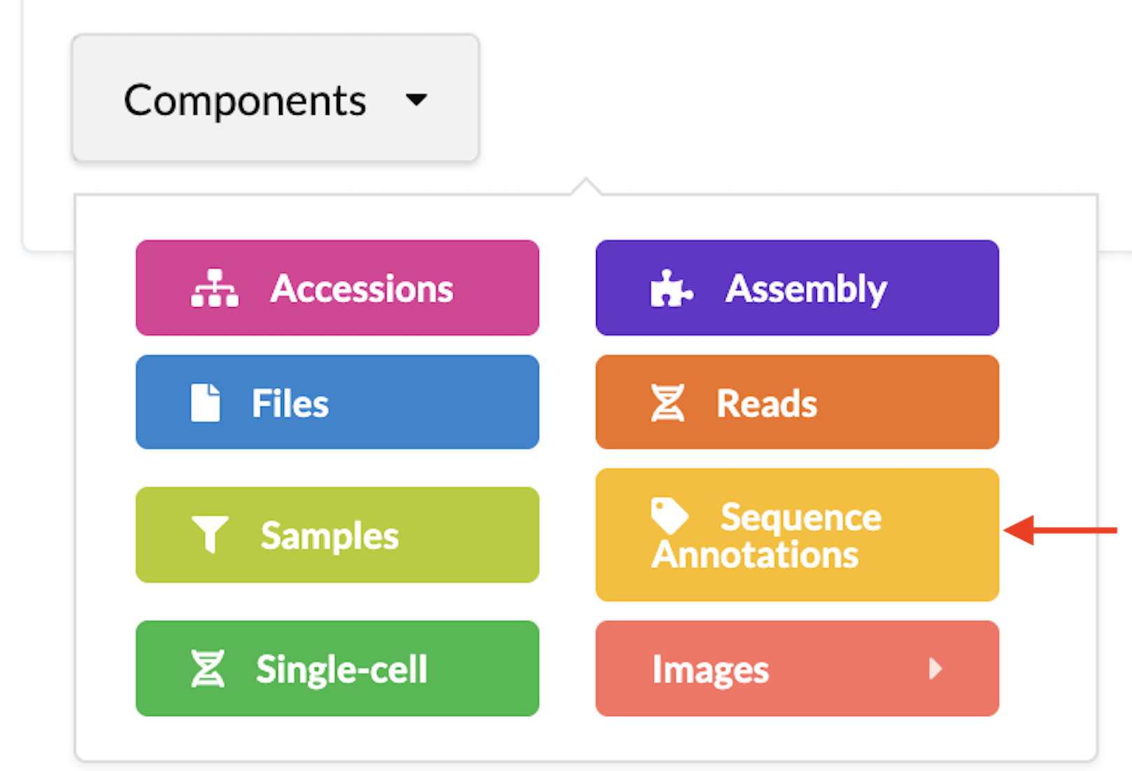
 button to add
Sequence Annotations as shown below:
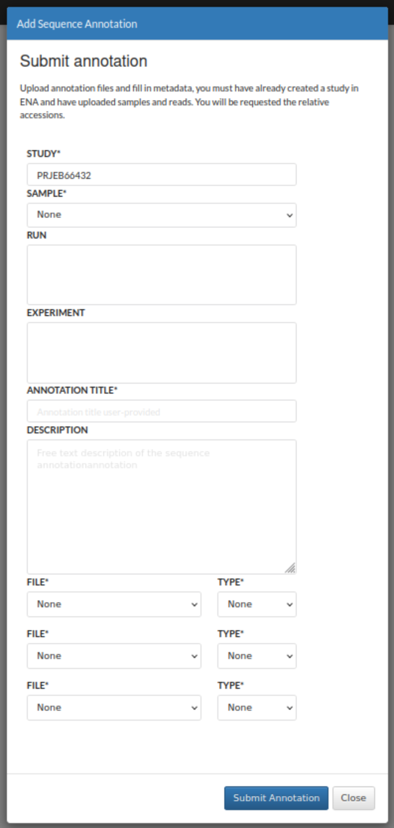
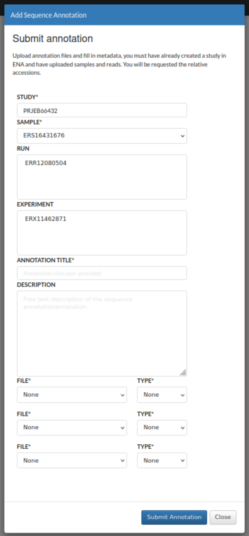
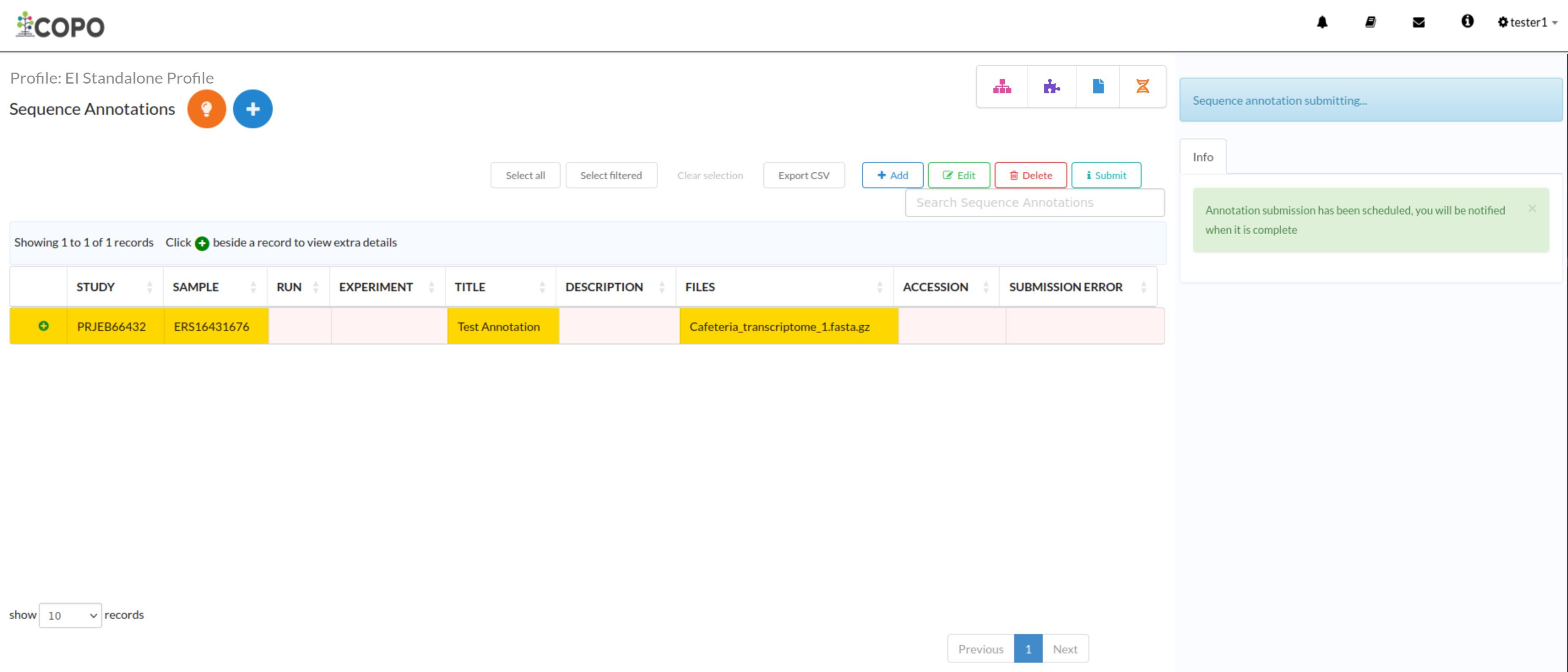
button to add
Sequence Annotations as shown below: